To go back to an entry from last Tuesday, if Tulsa's Civic Center Plaza is a bad example of a public space -- in fact is one of many examples of failed plazas that can be found across the country, even in major pedestrian-friendly cities like Boston -- what makes for a good public space?
Back in the 1970s, architect Christopher Alexander and his team set out to identify successful design patterns in the construction of homes, neighborhoods, and cities. One of the patterns was called "Small Public Squares":
A town needs public squares; they are the largest, most public rooms, that a town has. but when they are too large, they look and feel deserted.
The solution was to keep the square to a maximum width of 70 feet. A square could be any length, but the width should be "smaller than you would first imagine." I've seen wider public squares that are successful -- for example, most of Savannah's squares are about 180 feet across on the narrow side, but the space is shaded by tall live oaks, broken up with grass, paths, fountains, and statuary, and every point in the square is with in eyeshot and earshot of the nearest street.
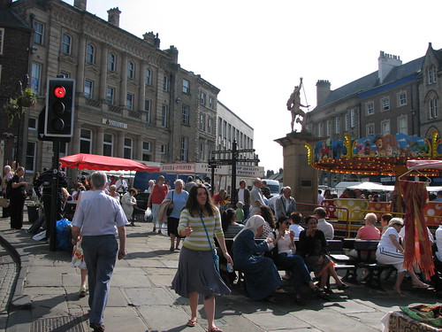
During our trip to Britain, we came across one very lively public square in the City of Durham. On Saturday afternoon, it was packed with people visiting market booths in the square and visiting the shops along the square and in neighboring streets. There was a small teacup ride for children. You could buy candy floss and other treats. The square, about 90 feet wide and 150 feet long, was defined on two sides by buildings with storefronts and the other two sides by narrow streets (at most 15 feet across), with buildings and storefronts on the other side.


Comments (1)
That's why shopping malls are successful. Lots of parking, easy access to specific destination, and lots of interesting things to see, do, and eat. Tulsa's Civic Center Plaza was not designed to do that. It was a government center. Having separate functions in separate buildings reduced foot traffic congestion while allowing citizens to park once for several venues. It's still a good idea, but maybe somewhere else. Good point about not letting these spaces get too large. Cherry Street is one-half mile long. Brookside naturally divides into at least two parts, north and south. All successful. Other neighborhoods are attempting the same. Cities are hundreds of villages with common borders. If Tulsa would focus on the success of these small enterprises instead of the big score, our long-term future would be brighter.
Posted by Booksider | July 2, 2007 8:22 AM
Posted on July 2, 2007 08:22