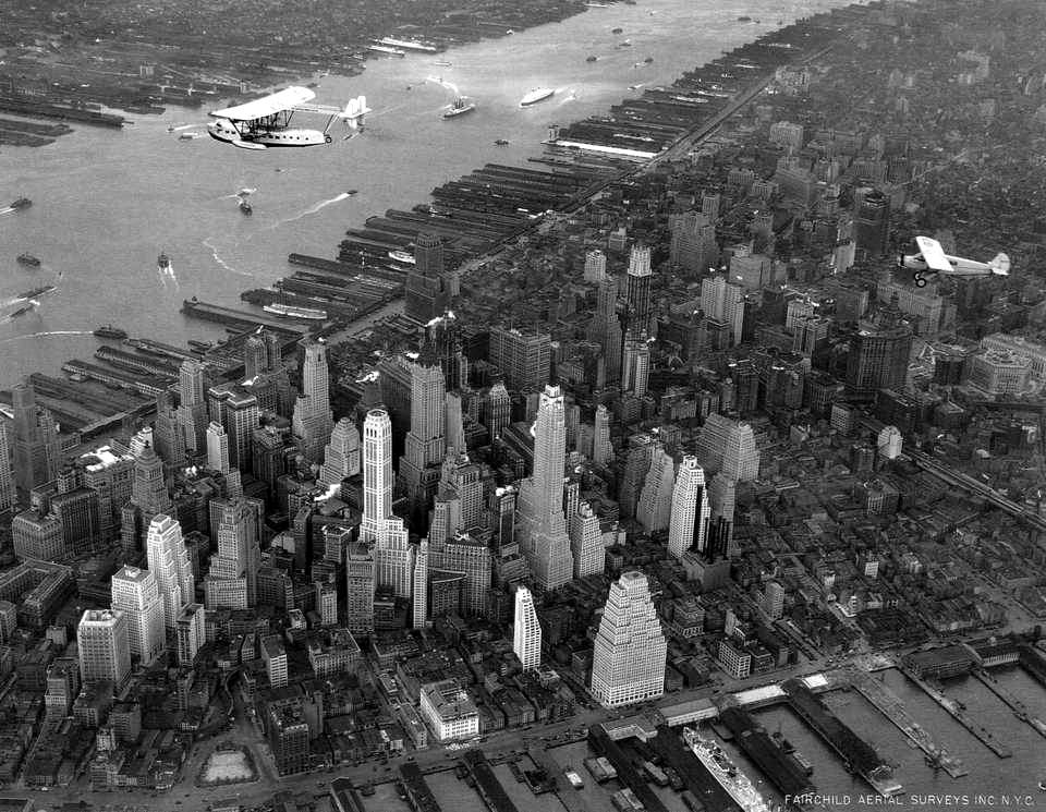
"A city of spires"
Via Mister Snitch, a beautiful collection of photos of New York, arranged chronologically, beginning with 1885, when horse-drawn carriages and trolleys dominated Manhattan's streets. Most of the pictures were taken when skyscrapers looked like steeples, turrets, and minarets, before the 1960s influx of flat-topped glass and steel boxes. (Click the thumbnails to see full-sized images.)
Mister Snitch calls them "photos of a romantic, antique, B&W New York," and I think they deserve a romantic soundtrack, so here's Charlie Spivak and his orchestra.
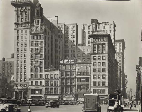
This photo and its caption are worth highlighting:
Union Square West. A hilarious jumble gets A+ for accidental design. These lots once held town houses. Their dainty footprints have been preserved, so the buildings have a delicate scale regardless of their height. One is a miniature skyscraper. Scale-obsessed NIMBYs take note: you need to object to a building's footprint, not its height.
A great point. The constraints of lot lines, alleys, and the street grid generate a more pedestrian-friendly experience at the ground level. Instead of one large building with a single entrance framed by blank walls or reflective glass, you have at least five building entrances in a single block -- five different window displays to catch your eye, five places to duck in out of the rain, five places to escape from a creep. Changes in construction finance provided the deep pockets to enable developers to buy out an entire block at once, rather than buying and redeveloping one lot at a time. Urban renewal cleared whole blocks at a time, and cities became willing to vacate streets and alleys to suit the demands of developers.
My biggest complaint against the proposed Bomasada development in Brookside is not its height, but the fact that it is one huge blocky building with a single entrance, and rather than creating more connections between the residential and commercial areas, it creates more obstacles. A development of individual three to four-story townhomes or apartment buildings (2 or 3 units per floor) with separate entrances, and at least one public way connecting 39th Street to the Old Village Shops, would "enhance the value, image and function of area properties" in a way that satisfies the condition on page 7 of the Brookside Infill Plan for higher-density residential development in the residential area on the boundary with the commercial area.
0 TrackBacks
Listed below are links to blogs that reference this entry: "A city of spires".
TrackBack URL for this entry: https://www.batesline.com/cgi-bin/mt/mt-tb.cgi/4036


I could listen to Spivak all night. This might be your best post EVER.
New York doesn't look that different now. It still has the same style of architecture, just more crowded.