A tour of the BOk Center
This week in Urban Tulsa Weekly, I wrote about a tour I was given a few weeks ago of Tulsa's BOk Center arena, scheduled to open this fall. Far from winning me over, the tour convinced me that by foregoing the "iconic" approach to architecture we could have had, for an amount closer to the original budget, an arena that would make a positive addition to downtown's urban fabric.
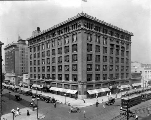
In the column, I mentioned another Cesar Pelli public facility with a curved, "iconic" glass wall. That's the Benjamin and Marian Schuster Performing Arts Center in Dayton, Ohio. The Schuster Center opened in 2003; construction began in 2000. The Rike Building, a handsome seven-story Sullivanesque department store built in 1911, was demolished to make way for the Schuster Center. Before:
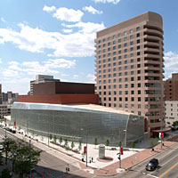
After, from about the same angle:
You can see the transformation from good urban form which works well at a distance and up-close at pedestrian scale to a building that is somewhat interesting at a distance but monotonous up close. You would have been able to peek in the display windows of Rike's; the reflective glass on the Schuster Center won't let you see inside.
If you want to take a virtual Google Street View stroll past the Schuster Center, as I suggest in my column, start here and head west on W 2nd St.
0 TrackBacks
Listed below are links to blogs that reference this entry: A tour of the BOk Center.
TrackBack URL for this entry: https://www.batesline.com/cgi-bin/mt/mt-tb.cgi/4135


That Pelli thing looks like a big beat-up water tower driving south on I 244 on the west side looking east. From some vantage points, it looks like a giant air conditioning unit or condenser or something. I keep waiting for steam to come billowing out of the top of it.
If I had a punch list the first item on the list would be: Fix those loose looking silver tiles.
They should be completely flat and shiny. There should be no bubbles.
I like some iconic architecture and I think the Schuster Center is a cool building; however, its a bad use of iconic architecture.
I agree, it's unfortunate that they tore down an existing building that fit the fabric of the area with one that fit only the architect's personal artistic taste.
Ironic that they put park benches out front! Without street level retail to attract pedestrians they will be hardly used.
I personally hate the "Icon". Nothing will make me like it.
I drove past on the west side Sunday, as I was headed up north on the L. L. Tisdale Expressway. Jeff's right about all the wrinkles in the skin. It really does look like a roll of duct tape. The color is exactly right.