Blogosphere: August 2008 Archives
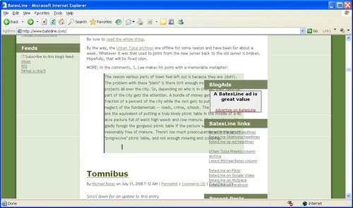
When the Sitemeter mess came to light over the weekend, I noticed that this site looked funny in my laptop's copy of Internet Explorer 6, which is still the second-most popular browser among BatesLine readers. (IE 7.0 has taken the top spot, and Firefox is gaining rapidly.) There was blue space around my header image, and the right sidebar had slipped way down the page and to the left. The header image and the text looked like it had been enlarged using a particularly bad algorithm, and I noticed that on most sites, images appeared to be stretched out and pixellated. It was as if I had the magnifier turned on just for IE, but I couldn't find anywhere to turn it off.
Here's what I saw in the header (click to see the full size version):
And here's the sidebar overlap:
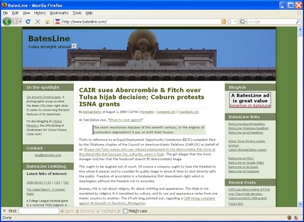
Everything looks normal in Firefox 3.0.1 and in IE 7. A reader e-mailed to say that things looked strange in his browser, too, although he didn't say which browser he was running. I went to browsershots.org to see what it looked like in various browsers, and it showed everything looking fine in IE 6.
Here's what it's supposed to look like (again, click to see the full size version):
If BatesLine doesn't look like that, please drop me a line at blog at batesline dot com, and let me know what browser and what version of the browser you're running and what kind of weirdness you're seeing. (Click the "Help" menu, then select "About...", and it'll show you the version number.) Thanks in advance for your help.
There maybe something funky about my particular Internet Explorer configuration. Or it may be a problem with the style sheet. I don't think Sitemeter is responsible, as the problem persisted after I removed Sitemeter. (I'm going to put it back now.)
EUREKA! Don Danz identified the cause and the cure. Evidently Dell thoughtfully altered the DPI setting of my high-res display to make icons and fonts look bigger, and it messes up websites. I put the DPI back to the default (96 dpi) and all is well.


