Cities: May 2008 Archives
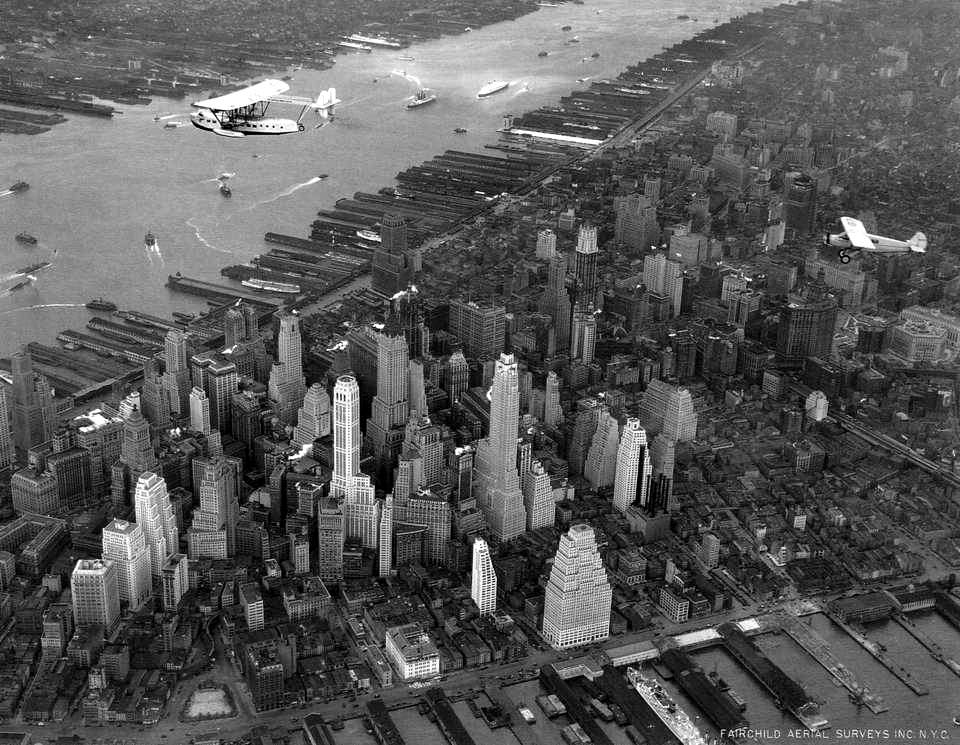
Via Mister Snitch, a beautiful collection of photos of New York, arranged chronologically, beginning with 1885, when horse-drawn carriages and trolleys dominated Manhattan's streets. Most of the pictures were taken when skyscrapers looked like steeples, turrets, and minarets, before the 1960s influx of flat-topped glass and steel boxes. (Click the thumbnails to see full-sized images.)
Mister Snitch calls them "photos of a romantic, antique, B&W New York," and I think they deserve a romantic soundtrack, so here's Charlie Spivak and his orchestra.
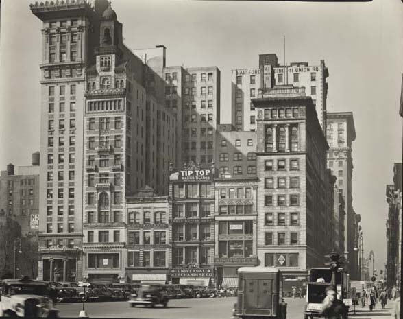
This photo and its caption are worth highlighting:
Union Square West. A hilarious jumble gets A+ for accidental design. These lots once held town houses. Their dainty footprints have been preserved, so the buildings have a delicate scale regardless of their height. One is a miniature skyscraper. Scale-obsessed NIMBYs take note: you need to object to a building's footprint, not its height.
A great point. The constraints of lot lines, alleys, and the street grid generate a more pedestrian-friendly experience at the ground level. Instead of one large building with a single entrance framed by blank walls or reflective glass, you have at least five building entrances in a single block -- five different window displays to catch your eye, five places to duck in out of the rain, five places to escape from a creep. Changes in construction finance provided the deep pockets to enable developers to buy out an entire block at once, rather than buying and redeveloping one lot at a time. Urban renewal cleared whole blocks at a time, and cities became willing to vacate streets and alleys to suit the demands of developers.
My biggest complaint against the proposed Bomasada development in Brookside is not its height, but the fact that it is one huge blocky building with a single entrance, and rather than creating more connections between the residential and commercial areas, it creates more obstacles. A development of individual three to four-story townhomes or apartment buildings (2 or 3 units per floor) with separate entrances, and at least one public way connecting 39th Street to the Old Village Shops, would "enhance the value, image and function of area properties" in a way that satisfies the condition on page 7 of the Brookside Infill Plan for higher-density residential development in the residential area on the boundary with the commercial area.
Although bits and bytes are its bread and butter, no major studio better embodies humanity in film than Pixar. A recent interview with Pixar director Brad Bird presents ten ways that Pixar promotes innovation. (Hat tip to Joe Carter's Evangelical Outpost.)
I found two points especially interesting. This one ought to interest Forrest Christian, who has been writing about adult underachievers over at his Requisite Writing blog:
Lesson One: Herd Your Black SheepThe Quarterly: How did your first project at Pixar--The Incredibles--shake things up?
Brad Bird: I said, "Give us the black sheep. I want artists who are frustrated. I want the ones who have another way of doing things that nobody's listening to. Give us all the guys who are probably headed out the door." A lot of them were malcontents because they saw different ways of doing things, but there was little opportunity to try them, since the established way was working very, very well. We gave the black sheep a chance to prove their theories, and we changed the way a number of things are done here.
Later, Bird explains how geography contributes to creativity.
Then there's our building. Steve Jobs basically designed this building. In the center, he created this big atrium area, which seems initially like a waste of space. The reason he did it was that everybody goes off and works in their individual areas. People who work on software code are here, people who animate are there, and people who do designs are over there. Steve put the mailboxes, the meetings rooms, the cafeteria, and, most insidiously and brilliantly, the bathrooms in the center--which initially drove us crazy--so that you run into everybody during the course of a day. [Jobs] realized that when people run into each other, when they make eye contact, things happen. So he made it impossible for you not to run into the rest of the company.
There are urban design parallels: The layout of some cities makes chance encounters likely; in others a serendipitous meeting is all but impossible. Chance encounters enable the cross-pollination of ideas, which makes the whole city smarter.
If you are walking to work, riding the bus, hanging out a neighborhood coffee shop, walking across downtown for a meeting, you're more likely to bump into someone you know and have that conversation you've been meaning to have when you get some time. If you're going from place to place in your car, you might wave at someone you know, but you're not going to stop for a chat.
Broken Evangelical Outpost link redirected to the Internet Archive on January 29, 2020. I modified the title from "Pixar innovation" to make it more descriptive. To elaborate on why cross-pollination and serendipitous encounters matter: A skill, idea, contact, or anecdote belonging to one person might be the missing piece of the puzzle for a problem that someone else is trying to solve.

